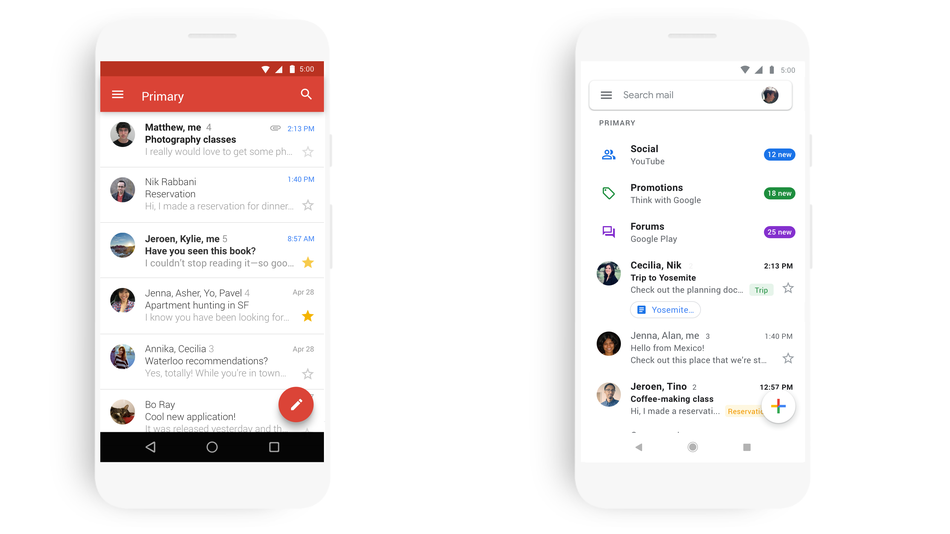
Google is going to redesign the Gmail app within a month and the update will follow thereafter. There is a lot of confusion over the changing of the app. Let me break the ice. Google is adapting the material design, nothing else. A few years back in 2014, it has adapted the design theme in its Gmail Web version and now it’s going to adopt the same on the app. Firstly, it will hit the Android and then on the iOS accordingly.

Gmail has recently removed its signature red bar from the top and some changes in account switching areas have taken place and overall design has also got a refreshed makeover with a lot more white color. We know that fact that adopting the material design will induce a lot of white colors but taking another fact into consideration where Google itself is encouraging all the apps on its play store to adopt a darker version to save power by minimizing the brightness. These two things contradict a lot and we are unsure about the behind the scene preparation of it. Google is a master of inventing new thing and who knows, it may introduce a material design in darker mode too? Nowadays in the tech world, it’s everything about uncertainty. God knows, what’s cooking up in Google’s mind.
But the official announcement is a general statement where it has been stated that the Gmail app will go through several changes one by one and it will be redesigned with a material look soon and users will get the final update by April through some intermediate updates.